

Or post to Tumblr


|
Additional information
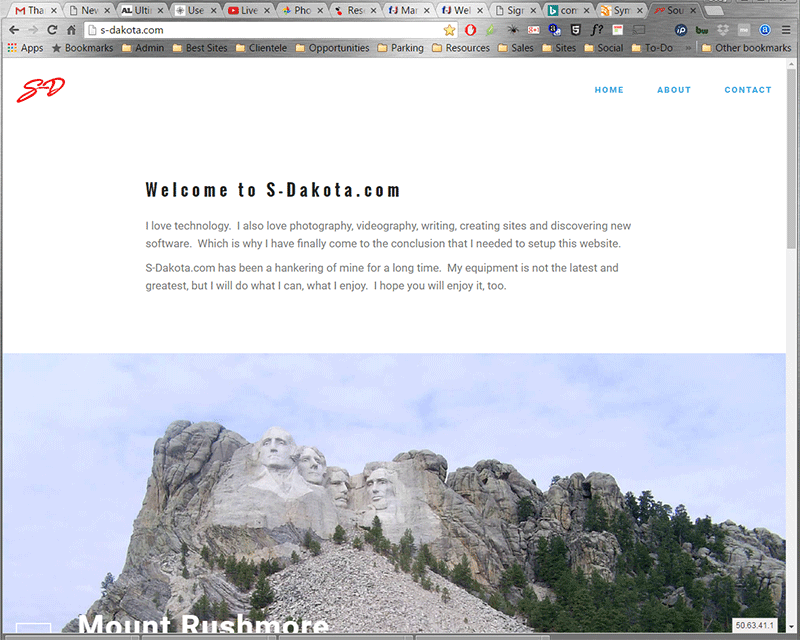
S-Dakota.com Website Snapshot
The S-Dakota Imagery and Resources is another example of a mobile-first responsive design and includes a few galleries that will look good on most any platform, from smart phone to tablet to high definition computer monitor and television screens.
|
Share this image |
Advertisement
